Delivering a successful digital travel product
How I developed the uniquely effective filtering approach for
Cheapflights global websites and Apps.
Meta Flight search context
Meta flight search is a common part of many travellers’ search for potential flights. Despite being in the travel space for some time, providing options on individual flights was a new approach for Cheapflights. They hired me to determine the strategy of the new product’s design.
Additionally, I worked to introduce UX thinking and approaches into the organisation. Then over time, build a team to continue the Product’s development. To view my strategic approach to introducing UX into the business and developing the team – see this case study
Below, I explore the Product Strategy and User Experience Design I completed. This was the Product design work that led to the new meta flights search products. The ultimate result of the design work I did on the product led to the later successful sale of the company
Key pathway and gates to successfully building a core design for the product

The High level Product Strategy
I analysed the market, the key players and their approaches. Several large scale players like Kayak and Skyscanner had been in the market for some time. They had established dominant positions. They had a number of features that they had enhanced their products with over time. However, the designs of these competitor sites were constrained by technical and commercial factors. As a new offering I positioned us in place that avoided these factors. In determining a place for the Cheapflights to operate, I made arguments that enabled us to create a unique solution to offer users.
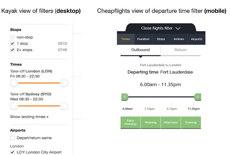
Contrast example between the Departure Times filter on Kayak (Desktop) vs Cheapflights (Mobile).

Behaviours of Users on Results Screen
I analysed the behaviours of users on results screens through observation and interviews. The typical behaviours were:
- Orientation – determining what the flight options and baseline price of the cheapest options.
- Scan and review – looking at each flight option in turn to determine its suitability. (I conducted research on how they went about doing this).
- Filtering – applying filters to the base date/location search, based upon typical filter prioritisation.
- Sorting (long haul behaviour) – Quickest / Balanced options / Cheapest
Behaviours to insights and design directions
Each of these actions drew the attention of the users to a specific area for a period of time. During these periods other areas became irrelevant and even distractions. Eg When scanning results – the filters were totally ignored. I determined a strategy in the design of the product that took advantage of this separation. I ensured that when the user was focused on a particular aspect, the interface would focus on that aspect. The sacrifice was that all the interface elements were not permanently visible. They were highly accessible through quickly accessible options and speedy interactions. The page reacted to the user intention rather than being a static structure that meant the users attention had to move around.
Representation of the live Cheapflights results page (visual design and branding applied).

Strategic Design Advantage
Once open, they could use the screen real estate to provide additional valuable informational context. The page reacted to the user intention rather than being a static structure that meant the users attention had to move around. The design direction chosen meant it was impossible for the competition to match. It was this difference in approach that enabled us to create a niche and grow our user base. This resulted from the enhanced experience users had in each of the stages of behaviours outlined above.
Example additional contextual information, greater ease and precision for interaction controls and quick shortcut options found in the Cheapflights’ departure times filter.

Market and Competitor Analysis
I completed the following key actions:
- Conducted analysis of the competition’s approaches.
- Determined the areas where we could have a competitive advantage over our chief rivals.
- Reported the high level findings to the executive committee.
- Put forward the proposed path towards the direction I would take on the design and won the approval of the Executive group.
Context – for Filters design
A crucial part of the development of the Cheapflights meta search website and App products was the filters experience. This needed to fit seamlessly into the overall product strategy for the results page. This was the conscious choice I made that enabled me to provide superior contextual information.

Cut-out screen shot of the wireframe prototype of the winning screen design with filtering toolbar accessible from the bottom of the screen.
Research and Data analysis to inform design
Research that I had conducted, alongside data analysis of the filter usage pointed me towards the priority that users put on filters. Which filters they applied first and which had the largest impact on price changes. Nearly all the competitors adopted a fairly standard approach to filter design and placement. This was to place all of them on screen (the most important ones visible above the fold) in a column on the left hand side. The number of filters to be fit in this space was constrained. The possibility of providing useful information about what the effect of applying the filter would be was very limited.
User Behaviour for filtering
There were user behaviours that I had observed in use of filters. One was that users adjusted one filter at a time and then assessed the new results that were presented.
The reason was partly tied to the anchoring effect. The cheapest price presented in the original returned results provided this. When they applied a filter the list of flight results would refresh. From here users could make an assessment of the possibilities.
1. They would look at the results, seeing the new cheapest flights.
2. They would then determine if the filter (eg. more convenient airport) option was ‘worth it’.

Individual filters were typically applied once (eg. direct, one stop, etc). They were often not adjusted, meaning their visibility was not that useful after application.
This behaviour, with others meant permanently showing filters was not optimal. Frequently, other sites, filters took up valuable screen real estate for limited return.
Designing to complement behaviours
I sketched out the wider structure if the interface, with the abstract parts of the results page in place.
These included:
- individual flight results modules,
- filters and sorting tab
- cheapest, quickest and smart value.
This allowed me to determined how the various parts would work together to create a cohesive and effective experience.
I moved on to design the details of each aspect and refined the screens in Axure during phases of iterative cycles. I interspersed with usability testing where alternative designs competed against each other.
The metrics were based on:
- speed of perception by users,
- perceived ease
- accuracy of determining appropriate flight choices.
- time to locate the ideal flight
- reviewing the details to be willing to commit
This required the creation of highly functional prototype designs in Axure. These were used to simulate the responses of users selecting particular flight criteria. This way, I could ensure that the usability tests were task based, realistic and equal. From these various tests I established ‘winning designs’ for the various aspects of the results page.
Innovative (single use optimised filters)
I positioned the sites in a strategically different place from the competition.
As part of this overall design, I determined to place the filters in a toolbar along the bottom of the screen. The bar itself (and the filter options were always available in 1 click).
The detail of the filters were hidden behind headers for each filter type. This approach, required the users to click to view the specific filter they were looking for.
The focus of most of the available screen real estate was then made available to the user. This opened up many design possibilities.
We could provide to the users:
- Superior information about the results of applying a filter before they were applied.
- Larger targets for users to maipulate interactive elements
- Shortcuts to applying particular refinements
Benefits of this approach included:
- Preventing users from conducting wasted filtering actions and refreshes to determine the consequences.
- Giving users greater focus on the useful additional information based on their filter choices.
- Enabling users to arrive at the most relevant scope of results efficiently and with great confidence.
Overall, this filter experience proved to be an exceptional and powerful product differentiator. Due to the structural nature of this design differentiation, the competition could not match these user benefits.

The competition mainly relied on filters being visible by default with most being accessible by scrolling down. They sacrificed presenting more detailed information and the other aspects with this approach.
Status Never in Doubt
I created an additional design solution for users to understand the new options after adjusting a filter.

Updating results based on criteria
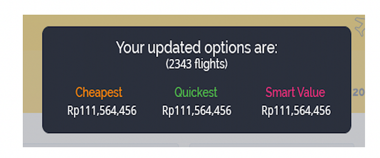
On most sites users had to wait for the full result set to reload to see the new best options. This was not the case on cheapflights, a quick summary was presented before the full results were presented visually. This was almost instantaneous. Taking advantage of smart processing and not having to wait for the UI to be rendered.

Closeup – of the updated flights information post selecting a filter
Iterations and Enhancements (Iterative Product Enhancement)
Beyond these base filters, I continued to design and enhance the capabilities of the filters, to be increasingly powerful, efficient and effective.
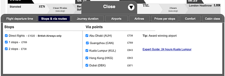
Example of enhanced information (solo Airline serving route, insights into connecting airports and guides to cities where travellers will stop over)

These were just some of the numerous features I added to the filters by iteratively enhancing the experience over time.
View case study on how I introduced UX to the organisation and built the UX department.